
Download _a e i o u font - _aeiou2U.ttf by Pia Frauss


About _a e i o u font
Please don't ask me why there are two German emperors called Friedrich (= Frederick) III: I might be tempted to explain. By a funny coincidence, they were those who reigned shortest and longest: the Hohenzollern one for just 99 days, in 1888, and the other -- the Hapsburg one --, for 53 years, from 1440 to 1493. My font is based on one of the more than 40,000 charters from the latter's chancery that have come upon us; and an exceedingly somptuous document it is, created in the year of the Lord 1460, and announcing a reward to 'our worthy city of Vienna', because its citizens had taken Frederick's side in a battle his younger brother, duke Albrecht (= Albert), had forced on him. Those brave citizens of Vienna, the charter tells us, had manly and selflessly resisted the rebellious duke's attempts to conquer their walls, and had in the end even chased him and his troops from the suburbs. Therefore, said charter is granting the city of Vienna the right to incorporate the imperial two-headed eagle into its coat of arms, and illustrating this new coat of arms by means of a painting at the center of the text.
Alas, there is a follow-up to the story. The worthy citizens of Vienna, in 1460, seem not to have thought much of this imperial gift. For, when duke Albrecht returned in 1462, freshly supplied, they not only opened their gates to him, but joined his forces, besieging the emperor in his residence, and going as far as to fire their canons at the appartement of his wife (who was, by all accounts, a delicate Portuguese princess). The best explanation for this is that Frederick never owned much money, and refused to live beyond his means, whereas his brother was nicknamed 'The Spendthrift' -- so, in the hope of a more substantial reward, Vienna bravely abandoned the two-headed eagle.
Why is my font called _a e i o u? Well, how could a font based on one of Frederick III's charters be called anything else?
Posterity has decided that Frederick has presented them with a riddle. He kept a notebook, written 'with my own hand', and one of the first things he entered, were the five vowels, underlining them with a stroke, and declaring, 'At whichever edifice, or on whichever silver vessel or clerical ornate, or other trinkets AEIOU, the stroke and the five letters, appear, that has been mine, Frederick the Younger's, or I have got it built or made'. Nobody knows what he wanted these vowels to mean. It's a good guess to assume he didn't know it himself. However, since they were always considered to be an abbreviation, explications abound to this day.
None of them are compelling. The only thing that's for sure, is that Frederick can never even have dreamt of the silly Austriæ est imperare omni universo (I hereby refuse to translate this nonsense) interpretation, which was later added in a different hand; for Frederick's notebook got stolen one day, and resurfaced after two centuries, showing a lot of alterations. Twenty-one years of age when he conceived his AEIOU idea, Frederick was then an obscure little duke of Styria who had until recently been shamelessly robbed by his guardian uncle (the older Frederick, aptly nicknamed 'Of The Empty Pocket'), with next to no hope of becoming emperor one day --: why he got elected, is another, still unsolved, riddle. And throughout his life, his style of ruling was for the most part utterly defensive; actually, he hadn't got the means to finance aggression. Moreover, if the future of his family had been such an important consideration to him, he'd not have postponed his marriage until he was thirty-seven, and, after his wife's early death, would not have contented himself with that only son who reached adulthood, while his male relatives were dying around him, childless (indeed he ended up as the ancestor of each and every Hapsburg after him). So, if you'd happen to stumble upon one of those frequent articles insisting on Frederick's 'fervent sense of a_[n imperialist]_ mission' -- please oblige me by not believing it.
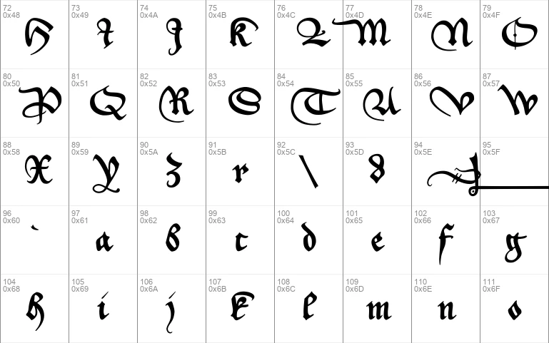
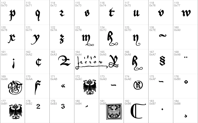
As usual, the number sign in this font has been replaced with a long s. The other special characters are:
- an alternate k on the 'less than' sign, and
- an alternate K on the 'greater than' sign.
Those have been made necessary by the regular K and k taking too much room -- looking rather messy in such important sentences like 'Jackdaws love my big sphinx of quartz'.
- an alternate r on the left bracket
- an alternate d on the right bracket
- a swashed m on the left curly bracket
- a swashed n on the right curly bracket
- a swash from the document on the ASCII tilde
- a swashed h on the bar and broken bar sign
- an alternate f on the masculine ordinal indicator
- a long s+t ligature on the long s sign
The coat of arms contained in this font is based on the painting in the document. (In my coloured rendition at the top of this page, I've tried to keep as close to the original colours as possible.)
Update 2010 has redesigned all of the composite glyphs (correcting the dcaron, Lcaron/lcaron, and tcaron), and enlarged the dashes.
Download font
Free for Personal Use
This fonts are authors' property, and are either shareware, demo versions or public domain. The licence mentioned above the download button is just an indication. Please look at the readme-files in the archives or check the indicated author's website for details, and contact him if in doubt. If no author/licence is indicated that's because we don't have information, that doesn't mean it's free.
- _a e i o u Regular | _aeiou2U.ttf
_a e i o u Regular | _aeiou2U.ttf
- Font family: _a e i o u
- Font subfamily identification: Regular
- Unique identifier: _a e i o u:Version 1.10
- Full font name: _a e i o u
- Version: Version 1.10 June 2010, initial release November 2007
- Postscript font name: aeiou
- Designer: Pia Frauss
- Description: _a e i o u was created with the Font Creator Program from High-Logic.com
- License: If you want to use this font commercially, please visit http://www.pia-frauss.de/imp/cu.htm
_aeiou
_a e i o u (UNICODE)
__________________________________________
... was created by Pia Frauss in 2007, with High-Logic's FontCreator program, and updated in 2010. You have downloaded version 1.10 (completed in 2010).
I hope you'll enjoy this font.
The _a e i o u font is based on a charter issued in 1460 by the German emperor Friedrich/Frederick III.
It has been called '_a e i o u', because Frederick used to have marked all objects of value he possessed -- or got made -- with the five vowels (and the font's underscore contains Frederick's typical underline stroke: the mark wouldn't be genuine without that).
_a e i o u is free for private use. For commercial use, please visit my "Conditions of Use" page at
http://www.pia-frauss.de/imp/cu.htm
As usual, the number sign in this font has been replaced with a long s. The other special characters are:
-an alternate *k* on the 'less than' sign, and
-an alternate *K* on the 'greater than' sign
Those have been made necessary by the regular *K* and *k* taking too much room -- looking rather messy in such important sentences like 'Jackdaws love my big sphinx of quartz'.
-an alternate *r* on the left bracket
-an alternate *d* on the right bracket
-a swashed *m* on the left curly bracket
-a swashed *n* on the right curly bracket
-a swash from the document on the ASCII tilde
-a swashed *h* on the bar and broken bar sign
-an alternate *f* on the masculine ordinal indicator
-a *long s*+*t* ligature on the long s sign.
The coat of arms contained in this font is based on the painting in the document.
UPDATE 2010 has redesigned all of the composite glyphs (correcting the *dcaron*, *L/lcaron*, and *tcaron*), and enlarged the dashes.
_________________________________
Disclaimer:
1. The designer as well as owner of this font is Pia Frauss.
2. This is a free font, but it is restricted to personal use only. Commercial use may be obtained by paying a licensing fee.
3. This font may not be included in any commercial compilation of fonts, be it on CD, disks or other products, without the owner's permission.
4. Altogether, this font may not be used for commercial ends and financial gain without the owner's permission.
5. This font may be freely distributed, as long as the zipfile, including this text, remains unaltered.
6. This font comes as it is. There is no warranty -- express or implied -- offered by the owner, or supplier. The risk of any losses or damages resulting from the use of this font remains wth the user.
If you need any information not supplied by this or by the http://www.pia-frauss.de/ website, please write to fonts @ pia-frauss.de (please remove the spaces around the *@* before copying the address into your mail form).
(However, please note that no enquiries such as "how do I download/install/get such and such program to work with your fonts" will be answered in the future.)
More by Pia Frauss
Jane Austen Signature font
Download Jane Austen Signature font free | Pia Frauss
Xirwena font
Download Xirwena font free | Pia Frauss
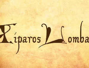
XiparosLombard font
Download XiparosLombard font free | Pia Frauss
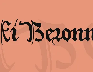
XiBeronne font
Download XiBeronne font free | Pia Frauss
Comments (0)
Lastest update
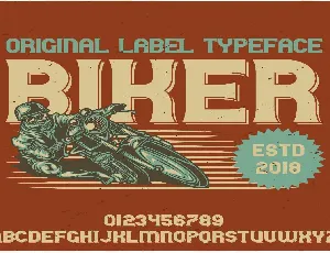
Biker font
Download Biker font free | Myfonts free
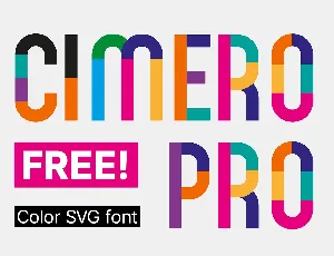
Cimero Pro font
Download Cimero Pro font free | Myfonts free
Mariget font
Download Mariget font free | Myfonts free
Sigatary font
Download Sigatary font free | Myfonts free
Clintone font
Download Clintone font free | Myfonts free
Beezle font
Download Beezle font free | Myfonts free
Bartone font
Download Bartone font free | Myfonts free
Aleana font
Download Aleana font free | Myfonts free