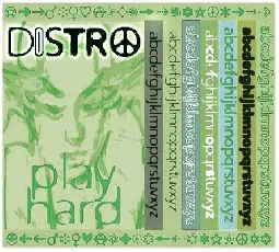
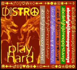
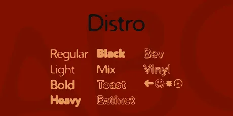
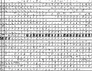
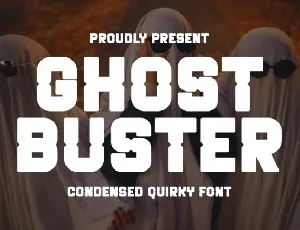
The DISTRO basic set includes Light, Regular, Bold, Heavy and Black versions, plus a fantastically useful set of matching Distrobats. You also get a Toasted version for breakfast and an Extinct one for scaring your aunt. Rumours of further variants abound... At least one of these fonts was included on the commercial FontHaus Exclusives CD, but you're getting them for free!
The Distro series was part inspired by Brody's ubiquitous Blur and also by the blurry print of a Chinese novel printed by the Beijing Publishing Co. (Ya gotta love 'em, go check out their catalog.) I adored Brody!Blur but felt hampered by the lack of weights.. and also by the fact that it's been done to death in these parts. (I guess that means it's a classic.)
So I started work on my own version, and was fascinated to discover how the character shapes changed with different blur and contrast settings. There's still a lot to be explored with the way light and focus affects type....
---
Helpful notes
These fonts were designed to be used at all sizes. I put a lot of work into making them readable as body text and you shouldn't have any trouble with that. But my true confession for this evening is that I adjusted the kerning and character spacing, particularly of the heavier weights, to suit larger size output. Use 'em big and you'll have lotsa fun, but if you need some Distro body text, you should increase the character spacing/tracking a little in your layout app. The effect should be that of glancing blearily over a printed page at 2am after one too many beers. (Now there's a design brief we can all relate too!)
That's all very well, but what color should it be? Hmmm.. You can get some very nice effects by reversing out the fonts on a black background. Don't get too saturated with color, keep to muted hues and work with the effect of light. Try some lime greens, some aquatic blues. Toast in particular looks wonderful that way, almost like a monitor burnout.
Now apostrophe has thrown a spanner in the works. He's shown me Distro-enhanced graphics which have made me realise that, used in a certain way, they can appear cartoon-like and rather funky. Try Extinct in bright pink, that's a good one.
I did start making a special filler font to accompany Toast. It fills the hollow spaces inside to give you a font that is essentially 3D. This isn't being released just yet, but maybe if there's a demand for it...
---
Sundry matters
These fonts are top notch, professional quality typefaces. A previous version of Distro Extinct has been sold commercially by FontHaus (now DesignHaus) on their FontHaus Exclusives CD, under the name 'Extinction'. If you bought this font from them, you should know that they released an UNAUTHORIZED and UNFINISHED version which has major flaws and many missing characters. Despite promises of a contract, FontHaus have never paid me a cent in royalties and I am currently taking legal advice. Font designers beware!
But rest assured, this Distro package contains the definitive final versions. I hope someone out there does some good stuff with them. Weeks and months and years of my life went into making these, so do the decent thing and USE them.
----
And now the moment you've all been waiting for - the Copyright Notice!
*fanfares, trumpets*
The original Distro fonts are copyright (c) 1997-2001 PJA Ramsey/Swordfish Design
The new, improved and finally released Distro fonts are copyright (c) 2001 Peter Ramsey/Swordfish Design & Apostrophic Labs. All rights reserved.
These fonts are offered for distribution as limited license 'freeware'. You are welcome to use them and distribute them in any way you wish, provided that NO MONEY CHANGES HANDS at any stage. A copy of this text file MUST accompany any and all fonts distributed in any manner. The font files themselves must not be modified, either by editing the outlines or by messing with the font's names, copyright or other notices.
If you would like to do something with these fonts which is prohibited by the above notice, please obtain some friendly advice from [email protected] or [email protected].
If you use these fonts in a commercial or other project and would like to show your appreciation to the designers, give whatever you feel is right to your favorite charity. You can also help by spreading the word about www.apostrophiclab.com. If you're *really* grateful, you can visit Peter's site www.swordfishbooks.com and check out the cool stuff on offer.
---
Distro
Devised and produced by Peter at Swordfish Design UK
www.swordfishdesign.co.uk
Revised and reproduced by apostrophe at The L'ab
www.apostrophiclab.com
Dedicated to Sabra, who told me they were beautiful :)
Typed by ;-Peter Ramsey on 30 August 2001. It's my birthday today!
I've known Peter Ramsey for years. Though time and life in general has taken its toll at sometimes eroding, sometimes strengthening that knowledge, we've stuck it out civilly through the years as much as 2 people on either side of an ocean possibly could. When Peter decided to come on board at the lab, I smiled ear to ear and thought to myself: "It's about time, boyo." He had sent me different styles of Distro a couple years previously, and I considered them very unfinished and a playful start at best.
Looking at the different elements and effects of Distro over the past couple months reminded me of what the early nineties brought in terms of fonts. Rubdowns and faxfonts and blurring and unfocus. Some hardcore typophiles theorize that without Deck and Brody there wouldn't have been a Carson, meaning that this sort of font was the meltdown that paved the way to grunge and deconstruction. I have other theories about that, but as far as Distro goes, it was refreshing to go back to the that pre-grunge era when everyone's eyes were being re-doctored with Photoshop and the idea of venture capitalism as a profession was becoming more widely accepted. In the early nineties I used to believe that display typography was part of pop culture, meaning that it reflected society and its attitudes. Now I believe that typography has nothing to do with society overall as much as it has to do with the colour of the sky in the typographer's head really.
Working on Distro was enjoyable. I haven't had to clean my glasses and refill my stein as many times since Metrolox. The time passed, the fonts were finished, and the sense of satisfaction one gets from finishing 10 fonts is nice. So there I was smiling ear to ear again.
Then it was time to work on the last font, Distro Extinct. Opened it in Fontlab and immediately sensed that there was something wrong. I'd seen those letters before. Meanwhile, the wire was zinging with email exchanges between Peter and myself, swapping style variations and yakking about the Distro pack and what to do with it. One of the emails he sent me contained a variation containing the notice "generated for Mark Solsburg." That stopped me in my tracks for a heartbeat. Then I slapped my forehead. I was sure that Peter had once told me that he was about to publish some fonts commercially. That Extinct version must have been one of them. Sure enough, in the Fonthaus catalog of a couple years ago was a font called Extinction, made by Swordfish Design UK, that matches the look of the Distro Extinct I was working on. I emailed Peter telling him something like "oh man, I'd totally forgotten that you were a commercial designer," and he emailed back "Ummm whaddayatalkinabout?" To save you all the little details here, it turned out that Mark Solsburg, aka fonthaus.com, dsgnhaus.com and fordesigners.com was selling an unfisnished version of a font that Peter sent him as a demo in 1998. It was being sold on a CD as part of the "Fonthaus Exclusives". And ummm Peter was the last person to know about it. There was no contract, no approval for publishing between the two parties, yet the font was grooved and sold who knows how many copies. Goooooooooooooo figure. The designer of the font didn't know that it was being sold until 2 years later, from a catalog lookup by someone who didn't have anything to do with any vital transactions.
Well, there you have it. So after all is said and done now, I'm packing this Distro pack with that same emotion that I had when I found out about that WinGear/GreenBay mess. This has been some summer. Nietzsche had it right after all, didn't he?
Ciao
© 2001, Peter Ramsey & Apostrophic Lab. All rights reserved. For more works by the designers visit www.apostrophiclab.com
This fonts are authors' property, and are either shareware, demo versions or public domain. The licence mentioned above the download button is just an indication. Please look at the readme-files in the archives or check the indicated author's website for details, and contact him if in doubt. If no author/licence is indicated that's because we don't have information, that doesn't mean it's free.
This font is freeware and can be used as is in any context without permission from Apostrophic Laboratories, except to produce material that is racist, criminal and/or illegal in nature. It is prohibited to modify any Apostrophic Laboratories font(s) for repackaging and/or re-release without an express written authorization by the designer(s) of the font(s) or Apostrophic Laboratories. Under no circumstance shall any Apostrophic Laboratories design or font design be sold or purchased. Email [email protected] if you want more information.
Yo reader of readme.txt files.
This document contains important information on the use of these fonts. You MUST read it ;)
(Copyright information at bottom, don't skip it now)
---
The DISTRO basic set includes Light, Regular, Bold, Heavy and Black versions, plus a fantastically useful set of matching Distrobats. You also get a Toasted version for breakfast and an Extinct one for scaring your aunt. Rumours of further variants abound... At least one of these fonts was included on the commercial FontHaus Exclusives CD, but you're getting them for free!
The Distro series was part inspired by Brody's ubiquitous Blur and also by the blurry print of a Chinese novel printed by the Beijing Publishing Co. (Ya gotta love 'em, go check out their catalog.) I adored Brody!Blur but felt hampered by the lack of weights.. and also by the fact that it's been done to death in these parts. (I guess that means it's a classic.)
So I started work on my own version, and was fascinated to discover how the character shapes changed with different blur and contrast settings. There's still a lot to be explored with the way light and focus affects type....
---
Helpful notes
These fonts were designed to be used at all sizes. I put a lot of work into making them readable as body text and you shouldn't have any trouble with that. But my true confession for this evening is that I adjusted the kerning and character spacing, particularly of the heavier weights, to suit larger size output. Use 'em big and you'll have lotsa fun, but if you need some Distro body text, you should increase the character spacing/tracking a little in your layout app. The effect should be that of glancing blearily over a printed page at 2am after one too many beers. (Now there's a design brief we can all relate too!)
That's all very well, but what color should it be? Hmmm.. You can get some very nice effects by reversing out the fonts on a black background. Don't get too saturated with color, keep to muted hues and work with the effect of light. Try some lime greens, some aquatic blues. Toast in particular looks wonderful that way, almost like a monitor burnout.
Now apostrophe has thrown a spanner in the works. He's shown me Distro-enhanced graphics which have made me realise that, used in a certain way, they can appear cartoon-like and rather funky. Try Extinct in bright pink, that's a good one.
I did start making a special filler font to accompany Toast. It fills the hollow spaces inside to give you a font that is essentially 3D. This isn't being released just yet, but maybe if there's a demand for it...
---
Sundry matters
These fonts are top notch, professional quality typefaces. A previous version of Distro Extinct has been sold commercially by FontHaus (now DesignHaus) on their FontHaus Exclusives CD, under the name 'Extinction'. If you bought this font from them, you should know that they released an UNAUTHORIZED and UNFINISHED version which has major flaws and many missing characters. Despite promises of a contract, FontHaus have never paid me a cent in royalties and I am currently taking legal advice. Font designers beware!
But rest assured, this Distro package contains the definitive final versions. I hope someone out there does some good stuff with them. Weeks and months and years of my life went into making these, so do the decent thing and USE them.
----
And now the moment you've all been waiting for - the Copyright Notice!
*fanfares, trumpets*
The original Distro fonts are copyright (c) 1997-2001 PJA Ramsey/Swordfish Design
The new, improved and finally released Distro fonts are copyright (c) 2001 Peter Ramsey/Swordfish Design & Apostrophic Labs. All rights reserved.
These fonts are offered for distribution as limited license 'freeware'. You are welcome to use them and distribute them in any way you wish, provided that NO MONEY CHANGES HANDS at any stage. A copy of this text file MUST accompany any and all fonts distributed in any manner. The font files themselves must not be modified, either by editing the outlines or by messing with the font's names, copyright or other notices.
If you would like to do something with these fonts which is prohibited by the above notice, please obtain some friendly advice from [email protected] or [email protected].
If you use these fonts in a commercial or other project and would like to show your appreciation to the designers, give whatever you feel is right to your favorite charity. You can also help by spreading the word about www.apostrophiclab.com. If you're *really* grateful, you can visit Peter's site www.swordfishbooks.com and check out the cool stuff on offer.
---
Distro
Devised and produced by Peter at Swordfish Design UK
http://www.swordfishdesign.co.uk
Revised and reproduced by apostrophe at The L'ab
http://www.apostrophiclab.com
Dedicated to Sabra, who told me they were beautiful :)
Typed by ;-Peter Ramsey on 30 August 2001. It's my birthday today!
I've known Peter Ramsey for years. Though time and life in general has taken its toll at sometimes eroding, sometimes strengthening that knowledge, we've stuck it out civilly through the years as much as 2 people on either side of an ocean possibly could. When Peter decided to come on board at the lab, I smiled ear to ear and thought to myself: "It's about time, boyo." He had sent me different styles of Distro a couple years previously, and I considered them very unfinished and a playful start at best.
Looking at the different elements and effects of Distro over the past couple months reminded me of what the early nineties brought in terms of fonts. Rubdowns and faxfonts and blurring and unfocus. Some hardcore typophiles theorize that without Deck and Brody there wouldn't have been a Carson, meaning that this sort of font was the meltdown that paved the way to grunge and deconstruction. I have other theories about that, but as far as Distro goes, it was refreshing to go back to the that pre-grunge era when everyone's eyes were being re-doctored with Photoshop and the idea of venture capitalism as a profession was becoming more widely accepted. In the early nineties I used to believe that display typography was part of pop culture, meaning that it reflected society and its attitudes. Now I believe that typography has nothing to do with society overall as much as it has to do with the colour of the sky in the typographer's head really.
Working on Distro was enjoyable. I haven't had to clean my glasses and refill my stein as many times since Metrolox. The time passed, the fonts were finished, and the sense of satisfaction one gets from finishing 10 fonts is nice. So there I was smiling ear to ear again.
Then it was time to work on the last font, Distro Extinct. Opened it in Fontlab and immediately sensed that there was something wrong. I'd seen those letters before. Meanwhile, the wire was zinging with email exchanges between Peter and myself, swapping style variations and yakking about the Distro pack and what to do with it. One of the emails he sent me contained a variation containing the notice "generated for Mark Solsburg." That stopped me in my tracks for a heartbeat. Then I slapped my forehead. I was sure that Peter had once told me that he was about to publish some fonts commercially. That Extinct version must have been one of them. Sure enough, in the Fonthaus catalog of a couple years ago was a font called Extinction, made by Swordfish Design UK, that matches the look of the Distro Extinct I was working on. I emailed Peter telling him something like "oh man, I'd totally forgotten that you were a commercial designer," and he emailed back "Ummm whaddayatalkinabout?" To save you all the little details here, it turned out that Mark Solsburg, aka fonthaus.com, dsgnhaus.com and fordesigners.com was selling an unfisnished version of a font that Peter sent him as a demo in 1998. It was being sold on a CD as part of the "Fonthaus Exclusives". And ummm Peter was the last person to know about it. There was no contract, no approval for publishing between the two parties, yet the font was grooved and sold who knows how many copies. Goooooooooooooo figure. The designer of the font didn't know that it was being sold until 2 years later, from a catalog lookup by someone who didn't have anything to do with any vital transactions.
Well, there you have it. So after all is said and done now, I'm packing this Distro pack with that same emotion that I had when I found out about that WinGear/GreenBay mess. This has been some summer. Nietzsche had it right after all, didn't he?
Ciao
'
Download Day Roman font free | Apostrophic Labs
Download Mechanihan font free | Apostrophic Labs
Download Ergonom font free | Apostrophic Labs
Download Devroye font free | Apostrophic Labs
Download Ralko Blur font free | Craft Supply Co
Download Sarnai Drawn font free | Craft Supply Co
Download Capires Rounded 3D font free | Craft Supply Co
Download Ibrahima Vilantte font free | Timur type
Download Halloman font free | ForzaType
Download Second Space font free | ForzaType
Download Mistletoe Magic font free | letterara
Download Ghost Buster font free | Pian45 Studio