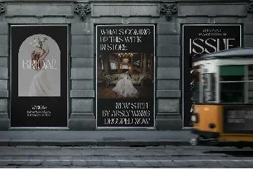
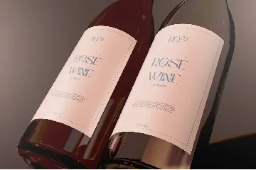
Niasec Lux Display Typeface font
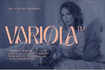
Luxury and Beauty Display Typeface
About Niasec Lux Display Typeface font
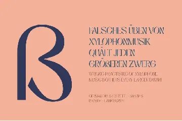
This time we want to experiment with organic-looking curves at certain angles in the typeface.
This work is called Niasec Lux Display. We make the original form as the curve’s spindle but do not force it to happen to the form of letters that are not compliant.
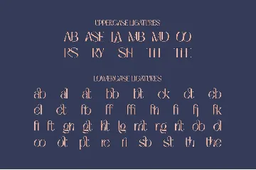
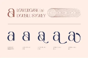
This is also done as a contrast value on each side. We find the shape of the letters in such a way is not disturbed by additional indentation as a marker for the letters’ authenticity. A little touch of calligraphy refers to the initial form and exploratory line movements to decorate the stylistic set and ligatures.
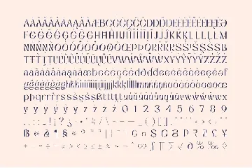
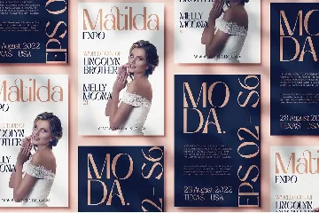
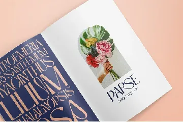
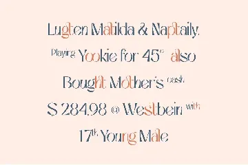
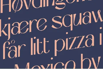
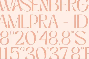
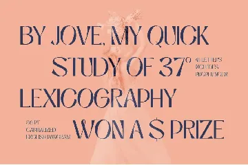
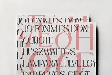
Niasec Lux Display is complete with character set styles, ligature, and multi-language support. Then add to the proportions of numbers and symbols in harmony with the basic letters, giving an earlier impression of the work you are about to create.
Similar fonts
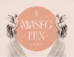
Niasec Lux Typeface font
Niasec Lux Typeface font | CasloopStudio

