OFL-LICENSE
Copyright (c) 2017, Bonjour Monde (http://bonjourmonde.net | [email protected]), with Reserved Font Names ‘Syne’
This Font Software is licensed under the SIL Open Font License, Version 1.1.
This license is copied below, and is also available with a FAQ at:
http://scripts.sil.org/OFL
-----------------------------------------------------------
SIL OPEN FONT LICENSE Version 1.1 - 26 February 2007
-----------------------------------------------------------
PREAMBLE
The goals of the Open Font License (OFL) are to stimulate worldwide development of collaborative font projects, to support the font creation efforts of academic and linguistic communities, and to provide a free and open framework in which fonts may be shared and improved in partnership with others.
The OFL allows the licensed fonts to be used, studied, modified and redistributed freely as long as they are not sold by themselves. The fonts, including any derivative works, can be bundled, embedded, redistributed and/or sold with any software provided that any reserved names are not used by derivative works. The fonts and derivatives, however, cannot be released under any other type of license. The requirement for fonts to remain under this license does not apply to any document created using the fonts or their derivatives.
DEFINITIONS
"Font Software" refers to the set of files released by the Copyright Holder(s) under this license and clearly marked as such. This may include source files, build scripts and documentation.
"Reserved Font Name" refers to any names specified as such after the copyright statement(s).
"Original Version" refers to the collection of Font Software components as distributed by the Copyright Holder(s).
"Modified Version" refers to any derivative made by adding to, deleting, or substituting -- in part or in whole -- any of the components of the Original Version, by changing formats or by porting the Font Software to a new environment.
"Author" refers to any designer, engineer, programmer, technical writer or other person who contributed to the Font Software.
PERMISSION & CONDITIONS
Permission is hereby granted, free of charge, to any person obtaining a copy of the Font Software, to use, study, copy, merge, embed, modify, redistribute, and sell modified and unmodified copies of the Font Software, subject to the following conditions:
1) Neither the Font Software nor any of its individual components, in Original or Modified Versions, may be sold by itself.
2) Original or Modified Versions of the Font Software may be bundled, redistributed and/or sold with any software, provided that each copy contains the above copyright notice and this license. These can be included either as stand-alone text files, human-readable headers or in the appropriate machine-readable metadata fields within text or binary files as long as those fields can be easily viewed by the user.
3) No Modified Version of the Font Software may use the Reserved Font Name(s) unless explicit written permission is granted by the corresponding Copyright Holder. This restriction only applies to the primary font name as presented to the users.
4) The name(s) of the Copyright Holder(s) or the Author(s) of the Font Software shall not be used to promote, endorse or advertise any Modified Version, except to acknowledge the contribution(s) of the Copyright Holder(s) and the Author(s) or with their explicit written permission.
5) The Font Software, modified or unmodified, in part or in whole, must be distributed entirely under this license, and must not be distributed under any other license. The requirement for fonts to remain under this license does not apply to any document created using the Font Software.
TERMINATION
This license becomes null and void if any of the above conditions are not met.
DISCLAIMER
THE FONT SOFTWARE IS PROVIDED "AS IS", WITHOUT WARRANTY OF ANY KIND, EXPRESS OR IMPLIED, INCLUDING BUT NOT LIMITED TO ANY WARRANTIES OF MERCHANTABILITY, FITNESS FOR A PARTICULAR PURPOSE AND NONINFRINGEMENT OF COPYRIGHT, PATENT, TRADEMARK, OR OTHER RIGHT. IN NO EVENT SHALL THE COPYRIGHT HOLDER BE LIABLE FOR ANY CLAIM, DAMAGES OR OTHER LIABILITY, INCLUDING ANY GENERAL, SPECIAL, INDIRECT, INCIDENTAL, OR CONSEQUENTIAL DAMAGES, WHETHER IN AN ACTION OF CONTRACT, TORT OR OTHERWISE, ARISING FROM, OUT OF THE USE OR INABILITY TO USE THE FONT SOFTWARE OR FROM OTHER DEALINGS IN THE FONT SOFTWARE.
README

**Syne**
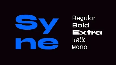
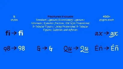
Syne is a 5-style type family originally designed in 2017 for the art center [Synesthésie](http://www.synesthesie.com), based in Saint-Denis in the very close suburb of Paris, France. Used across their identity, print and screen, Syne has been released under open-source license in June 2018.
**An unexpected journey**
When changing direction in 2016 and going from a 90’s-imprinted digital art center to a forceful and socially-involved structure, Synesthésie’s team felt the need for a visual and conceptual breakaway in their visual identity.
We got in contact with them in December 2016 when we were just finishing one of our first workshops — *Gutenbug*, organised in Paris — where we hacked inkjet printers and tried a different way of looking at a daily tool by using it in unexpected manners. We immediately connected around the ideas of accepting errors, fighting standardisation and creating interesting circumstances more than finished products. Then, although Bonjour Monde was first created to explore unconventional processes only through workshops, we started our first and only commissioned project.
Syne is one of its outcomes. Closely based on the art center’s team’s will to gather diverse artistic personalities to create fresh and enriching situations, the type family is an exploration into atypical associations in weights and styles.
**Regular, a geometric Trojan horse**
As we started sketching, something became prominent: we wanted the type to be new and strange, to respect both Synesthésie’s and our own beliefs, but also not to be subversive by throwing down all predefined codes and rules. Just like the art center is proceeding within standard institutions and spheres, we thought Syne should have one foot in the conformity by having a rather conventional Regular weight which would give the team a practical typeface for their daily use while making the rest of the family even more uncanny. We kept in mind the work of French writer Victor Hugo who wrote revolutionising plays using alexandrine and other traditional canons to defy the Classics on their own ground.
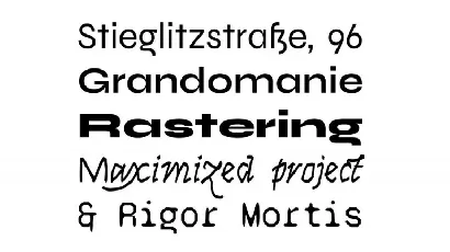
Syne Regular is a geometric sans, inspired by many standards of the genre but presenting quite condensed vertical proportions — short ascenders, descenders and uppercases — for a study yet pleasant feeling in longer texts. It also features minimalistic diacritic marks, reduced to the simplest form to only signify a presence.
**Bold & Extra, design space as a playground**
Synaesthesia — or *synesthésie* in French — is a phenomenon in which different kinds of stimulations get associated in the brain, such as sounds evoking colours. The weight system in Syne is thought as a take on synaesthesia in the type design field as well as a kind mockery regarding the more and more complex design spaces and the seemingly infinite possibilities offered by the recent Variable Fonts format.
When getting bolder, all the way to the dramatic and Eurostile-inspired Extra style, the type gains in width, drastically limiting the spectrum with this abnormal association and forcing radical graphic design choices. It is after all one of the strengths of custom-made type that, because it has been created knowing how it would be used, it does not have to care about pleasing everyone or fitting each and every situation, but can focus on conveying a strong identity without compromising. And it is also why we are curious and find it very interesting and important to release Syne to the public.
**Italic & Mono, two vector-twisted companions**
Both styles, side-kicks to a central Roman, carry deep scars of the tools that produced them, as to point out their inherent Bezier substance. The Italic shares its x-height and optical weight with the Regular, but draws its structures in flourished Renaissance types such as Robert Granjon’s and its peculiar flavour in the made-up exercise of trackpad-calligraphy. It is an hommage to yesterday’s masters using one of the most common gesture-based interfaces of today.
The Mono cut is built upon the Regular but has been strongly distorted with DataFace, a little program we made based on the classic [FontTools](https://github.com/fonttools/fonttools) library, that allowed us to automatically switch all on-curve points into off-curve ones and vice-versa. It gives the type’s contours a unique treatment, mixing arcs and straight lines in a completely unorthodox and vivacious way.
Bringing together History and the technical essence of nowadays typography, these two styles both integrated a part of surprise in their design process, a desired lost of control, an acceptance of error to bring out shapes that pure drawing would fail to imagine.
Imagining Syne has been a very exciting exploration, driven both by fun and serious interest in the many questions it raised. We took time to consider not only the importance of a custom type as main vector of an identity, but the meaning of the idea of family in typography. We ended up seeing it somewhat similar to the artistic gesture of Ready-Made, or *Found Object*, perfected by Marcel Duchamp in the early 20th century: not that the family preexists the designer, but that the mere fact of gathering fonts and calling them “family” can be most of what makes it a family, more than any objective resemblance.
We think of Syne as an assemblage of personalities — they can live all together, in small groups or on their own and will always create a surprising and distinctive visual situation.
—
Syne was imagined by [Bonjour Monde](http://bonjourmonde.net) and designed by [Lucas Descroix](http://www.lucasdescroix.fr) with help from [Arman Mohtadji](http://armansansd.net). The Mono style was distorted using Bonjour Monde’s [DataFace](http://gitlab.com/bonjour-monde/dataface), written by Arman Mohtadji. The Syne family is available with a SIL Open Font License.


