
Download Ud font - Ud Thin.otf by Tudor Banciu


About Ud font
THIS IS JUST A DEMO.
If you like it, and want to use it commercially, please buy it from www.fontspring.com/fonts/tudy1311/cybergothic?refby=tudy1311
-----------
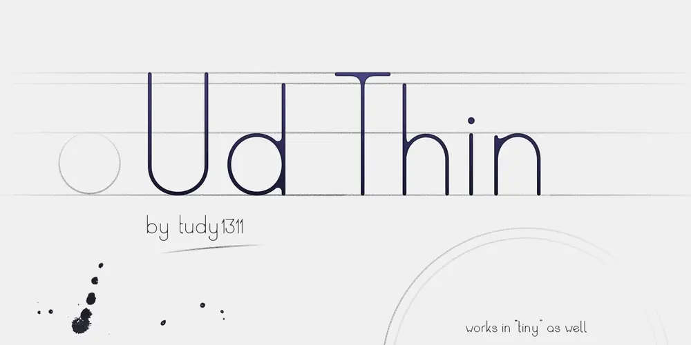
An aggresive typeface, through the harsh rhythm of heavy lines and thin serifs,plus narrow letterspacing.
This font has been made by writing with a 3mm calligraphy pen tip, trying to immitate a gothic style of writing out letters, but tilted all the way horizontally, instead of the normal 45° angle. By that rule alone, many decorative and intricate elements of the typeface had to be reduced to increase legibility. Then, the resulting letters were further geometrized in the vectorization process. A very stern, square-angled typeface is the result.
The serifs are mostly rounded, except for rectangular, decorative hairline serifs here and there.
In spite of its heavy and unforgiving aspect, it fits to many styles and looks. It is a headline font, it draws a lot of attention to itself through its dissonant, if geometric, presence.
----------
My font shop: www.fontspring.com/foundry/tudy1311?refby=tudy1311
My homepage: tudorstype.com
Download font
Free for Personal Use
This fonts are authors' property, and are either shareware, demo versions or public domain. The licence mentioned above the download button is just an indication. Please look at the readme-files in the archives or check the indicated author's website for details, and contact him if in doubt. If no author/licence is indicated that's because we don't have information, that doesn't mean it's free.
- Ud Thin Regular | Ud Thin.otf
Ud Thin Regular | Ud Thin.otf
- Font family: Ud Thin
- Font subfamily identification: Regular
- Unique identifier: Version 1.000;PYRS;Ud-Thin;2015;FLVI-614
- Full font name: Ud Thin
- Version: Version 1.000
- Postscript font name: Ud-Thin
- Trademark notice: Ud Thin is a trademark of tudy1311 (Tudor Banciu).
- Manufacturer name: tudy1311 (Tudor Banciu)
- Designer: tudy1311
- Description: Copyright (c) 2016 by tudy1311 (Tudor Banciu). All rights reserved. THIS IS JUST A DEMO. If you like it, and want to use it commercially, please buy it from http://www.fontspring.com/fonts/tudy1311/ud?refby=tudy1311 Thank you.
- License: THIS IS JUST A DEMO. If you like it, and want to use it commercially, please buy it from http://www.fontspring.com/fonts/tudy1311/ud?refby=tudy1311 Thank you.
ReadMe
THIS IS JUST A DEMO.
If you like it, and want to use it commercially, please buy it from http://www.fontspring.com/fonts/tudy1311/ud?refby=tudy1311
-------------
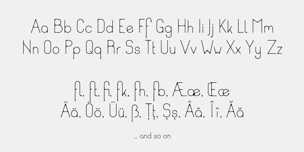
A thin, sans serif with a few ‘inconsistencies’ in the difference between the stems and x-height, for the purpose of making it a bit more informal. The concept is, to portray a rounded, friendly looking, simple font, and then create a visual effect to suggest it has been written with too much ink. All the places where two lines should cross and ought to create a sharp corner, this font is rounded off, to give it that bleed effect.
Some of the descenders and shapes have a bubble serif ‘symptom’, to suggest, the excess ink has started dripping downwards.
The font is easy to read in both very small text size, and just as useful in big. But of course, for the smaller versions, the rounded corners and “dripping” serifs are not as noticeable.
It works for a big variety of tonalities, from a bloody look all the way to a jelly/candy look.
--------------
My font shop: https://www.fontspring.com/foundry/tudy1311?refby=tudy1311
My homepage: https://tudorstype.com
More by Tudor Banciu
Lugoj font
Download Lugoj font free | Tudor Banciu

Hipstravaganza font
Download Hipstravaganza font free | Tudor Banciu
Dacian Donarium font
Download Dacian Donarium font free | Tudor Banciu
Comments (0)
Lastest update
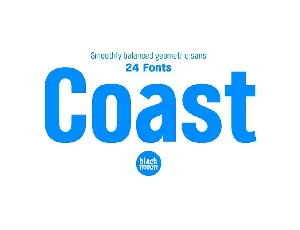
Coast font
Download Coast font free | Myfonts free
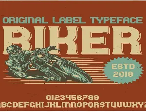
Biker font
Download Biker font free | Myfonts free
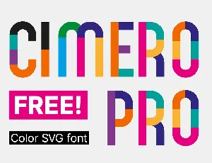
Cimero Pro font
Download Cimero Pro font free | Myfonts free
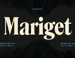
Mariget font
Download Mariget font free | Myfonts free
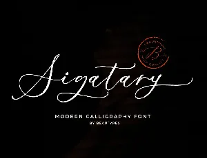
Sigatary font
Download Sigatary font free | Myfonts free
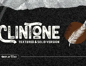
Clintone font
Download Clintone font free | Myfonts free
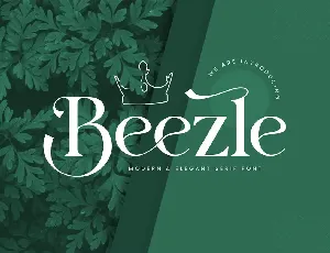
Beezle font
Download Beezle font free | Myfonts free
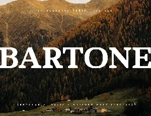
Bartone font
Download Bartone font free | Myfonts free