Hashtag #typography | page 130

Broadway | Font Pack
Broadway Inspired by the vintage script, but made a little more modern.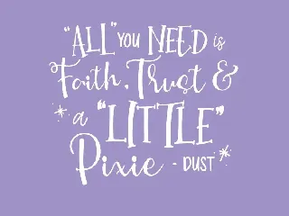
New Monday | Font Pack
New Monday is a new handwritten font pack from us, this font is really new and fresh.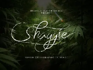
Shaggie font
signature typeface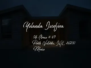
Original Sin font
Elegance Signature Type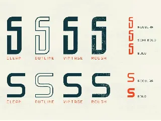
Gibsons Regular font
Gibsons Font Collection includes 20 fonts on the package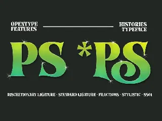
Histories - Fairytale Typeface font
Since the beginning, “Histories” has been inspired by the shape of the letters displayed on the cover of fairy tale books or animated film covers. Likewise with the naming of the font "Histories" so that the message of the letters is conveyed. And this stylistic combination should also be reflected in the lowercase set which also allows to open up a spectrum of possible uses. Basic calligraphy represents a solid basis for the development of lowercase glyphs, ensuring proper interaction with uppercase letters.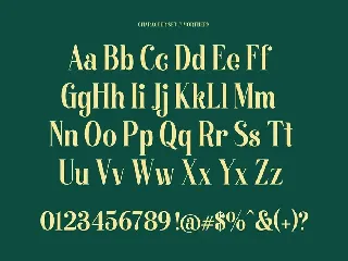
Morthern - Display Font
Morthern is inspired by the work of charming lettering artists with a combination of Old Style Display Bold. Each letter is modified so that the distance. Width and weight can give the beauty of the alternates given. A passionate curve gives a touch of beauty to this font. Come up with two different shapes in terms of uppercase letters that aim to distinguish between title of the letter and the paragraph.
Carbonera font
Brush Fonts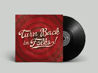
La Venice font
Old Script + Extra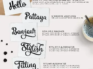
Vanilla Daisy font
Script Fonts with Tons of alternate characters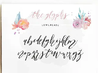
Patricia Dorothy font
Patricia Dorothy is a cursive, hand lettered typeface, best for branding and design work.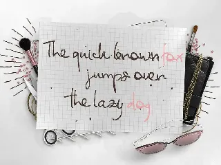
Anita Liana font
A casual handwritten typeface, best for artisan work.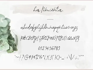
La Pimienta. font
Modern, clean & sophisticated monoline font for your design and branding work.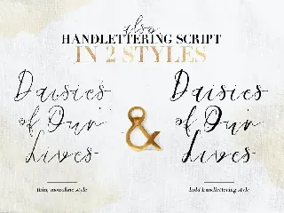
Daisies of Our Lives font
Modern serif & sophisticated monoline script font for all types of your branding work.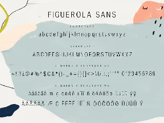
Figuerola font
Minimalist contemporary font in 2 styles, script & sans serif, best for all sorts of design projects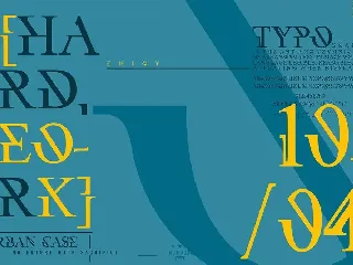
UrbanCase font
Modern Serif typeface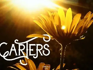
Carter Typeface font
Vintage , Carter, Typeface, Lettering, typography, handdraw font, fonts, inumocca, modern typeface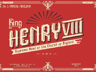
England font
classy medieval lettering, good blackletter
CEURETAS font
CEURETAS inspiration from origami, its full touch like you folding paper, with unique glyph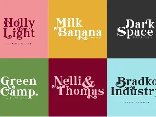
Morning Sunshine font
Morning Sunshine Modern Serif typeface , Opentype feature
